- Product
- Solutions
Solutions
Unparalleled performance for organizations requiring maximum security, control and efficiencyTailored automated gating pipelines trained on your data, for your useStreamline your data journey with automated uploads, end-to-end traceability, and integrated analysis - Resources
- Support
- Pricing
- Sign In
Understanding Data Scaling
A guide to understanding the principles and practice of data scaling.
Introduction
Data scaling (aka “transformation”) is foundational to cytometry analysis and yet remains a poorly understood and a seemingly unscientific aspect of the analytical process to most users. Scale settings are often not recorded nor communicated and yet are critical to a result and being able to reproduce that result. Since most software apply them automatically, even some seasoned cytometry experts aren’t aware of their existence nor the principles behind them.
This document overviews the principles and practice of data scaling and its relation to numeric properties of the data being analyzed. This concept can be tricky but understanding it will be a differentiating factor to your skills as a data analyst.
Watch the video
Work with scales and how this applies to the rest of your workflow.
Foundations
To understand data scaling let’s first consider an FCS file. This is a file produced directly from the instrument without further modification. As we know, an FCS file is a fancy way of storing a numeric matrix coupled with a variety of metadata.

The example of data and metadata above are abridged. Normally the numeric matrix could have thousands or millions of rows, which are often called “events” in cytometry. For the most part these are expected to be single cells (but could be debris, doublets, etc).
Metadata could have hundreds of entries. There are metadata entries that describe the file itself, the time of acquisition, information about the instrument and each detector, and many other pieces of information.
The columns which are named ftr are short for “feature”, which is the generalized name for a “channel” or “parameter” from cytometry vocabulary. The actual names have been substituted to serve as a general example. With actual data you might see feature names such as CD4, CD8, CD20, etc. Detector or dye names are usually included as well but are excluded from discussion here. Typically there may be dozens of columns depending on the instrument and reagents used.
Visualizing the Effect of Data Scaling
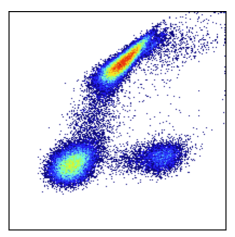
The data file used for the examples below is available for download here. It is a fluorescent file from a BD LSRII. Consider the example below of what the data look like raw, then with comp and scales applied:

Left (step 1): This is a visualization of exactly what is in the FCS file with no compensation and no scaling applied. It’s unusual to see this because most software will automatically apply compensation and scaling for you. Even if compensation hasn’t been applied, scales are usually being applied. In this case the data would appear scaled but not compensated. Such an example is at the end of this section.
Middle (step 2): Data with compensation applied. The characteristic spillover correction can be seen. Compensation should always be applied before scaling.
Right (step 3): Data with scaling applied after the compensation. (Note we used arcsinh scales with cofactor=400). Scaling has a dramatic effect on the data distribution. It helps appropriately represent the relationships in the data visually and numerically. Besides the visual difference, carefully note the axis labels. The units have changed dramatically as well. This is because scaling is a function that maps data from an original value to a new value. This is done for every datapoint and we get a new distribution of data as a result. An original data point could have a value of 5k, but after being put through the scaling function it has a value of 3.5. The resulting value is somewhat arbitrary and depends on the scaling equation used. The effect is log-like. Just like log(100) = 2. See also the section: Axis Labeling.
Why Is Data Scaling Standard in Cytometry?
Rescaling data distributions is a common operation in all analytics, not just cytometry. It is done whenever the analysis of the data is not appropriate in the original units of the data. This is the case for cytometry data, where positive signals can spread over massive numeric distances while dim or negative signals do not. Cytometry data are fundamentally log-like, and thus are rescaled accordingly to be interpreted linearly.
As a casual example to help underscore how this is a simple concept you are probably already familiar with, consider the following graph which is top of mind for many researchers:

Note the Y axis in log scale to more effectively visualize the relationship of the data. Cytometry data scaling follows a similar concept.
Consider also that the Y axis of this graphic could validly read 0, 1, 2 instead of 1, 10, 100. The former are the actual corresponding values of log(1), log(10), log(100). This is how we displayed the scaled data in the section above where we comment on the axis tick labels. As with Eroom’s case above, normally with cytometry data we also show the original data units on the axes. This is explained in the section: Scaling and Numeric Values / Labels.
Besides being visually convenient, scaling is critical for machine learning algorithms, which usually judge similarity and dissimilarity between individual data points linearly based on their underlying numeric values. If the numeric values are not scaled and still occur over a log-like distribution, then the algorithm will return bad results.
There Are Many Scaling Functions, All of them Similar
Background
At this point we know scaling is done by mapping data values through a function (see also the section which expounds on this). Now we’ll discuss these various functions which are all very similar to each other.
Classically, scaling was done with the base 10 logarithm (Log10). However as cytometry went digital, Log10 was no longer sufficient because it can’t handle negative numbers and offers no sophistication with how it modulates distributions. Thus many new scaling functions were developed and used in cytometry over the decades since. Other examples include biexponential, logicle, hyperlog, etc.
Each equation may have nuanced advantages and disadvantages but ultimately they are all very similar. Their core purpose is to provide a log-like function that handles negative numbers and has the ability to modify the behavior of the function in certain parts of the distribution, especially around zero. For more details on this, read the section below: modifying scale settings and how it affects data.
Now Log10 is almost never used except with old data or perhaps special cytometers. However it can technically be used with channels that guarantee positive values, which is usually the case for forward and side scatter, though these channels are not generally scaled in the first place.
Which Scaling Function is Best?
Which function is best, and why? As noted, in general they all do the same thing, and we don’t think a given one is better than any other for the purpose they serve. Consider the graph below which shows arcsinh scaling in OMIQ compared to biexponential scaling in a different software package:

Note that despite coloring differences owing to the specific plotting characteristics of the different softwares, the data distributions look essentially the same. With the correct configuration of either arcsinh or biexponential, it makes no difference which you choose.
We Think Arcsinh is the Best for the Field
In light of the above, it is our position that arcsinh is the best function to use for data scaling. We don’t have this opinion based on the properties of the algorithm; we note above that they are all similar. Instead we think arcsinh is best for the field of cytometry as a whole.
The arcsinh function is ubiquitous and simple. Every software that does numerical computation (including spreadsheet software, any programming language, Google’s search box, etc.) supports it. This means it is excellent for reproducibility and portability of results, a goal that is historically problematic for cytometry. By contrast, other scaling functions are heavily customized computational routines created only for cytometry. They are available nowhere except commercial software packages and sometimes to a limited extent in an R package. This situation is made more complex because commercial packages use secret, hidden parameters to these functions in addition to the ones they let you modify, and these hidden parameters may change based on certain heuristics not visible to you. So even if you have the ability to run the function in question (e.g., biexponential), you might not be able to reproduce the result in a different software.
This is why arcsinh is the default in OMIQ.
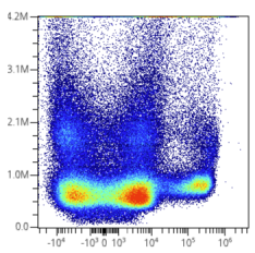
Display Boundaries Are a Distinct Concept from Scaling
Below (left) is the plot of compensated and scaled data from above. On the right is the same plot but with an adjustment to the display boundaries (min and max of plot axes). This moves the distribution into a better view with less dead white space. This doesn’t affect the numeric properties of the data, just the view of the data on the plot:

Display boundaries can be changed in OMIQ anytime a plot can be seen. They are stored and edited in original data units as opposed to scaled or otherwise transformed units. This is to keep display properties consistent throughout the workflow even as the underlying data are transformed. Technically, the display boundaries are transformed along with the workflow from the beginning.
Again, these properties are completely separate from the concept of scaling data. They are grouped together in OMIQ and other software out of convenience, and because they are related conceptually in how an analysis workflow gets done.
Note that in OMIQ there are no limits while setting boundaries. You can add or remove as much space as you want on the edges. It’s arbitrary. This is to be contrasted with certain other software which do limit.
Scaling and Numeric Values / Labels
It was previously explained why the scale tick numbers change to become smaller after scaling. I.e., these are the real data values being visualized and analyzed. However, classically, most cytometry software hide them and instead use a trick to provide a label with the original data values. OMIQ does this in certain cases as well. Like this:

You may see a similar effect in other functionalities within OMIQ, such as when viewing statistics, box plots, heatmaps, etc. These are simply the true values and haven't been reversed back to original units. If you want to manually reverse them in post processing for an important figure, follow the directions established in the section: Scaling is the Application of a Function on Data. Certain options in OMIQ may allow you to choose whether to reverse or not. For example, when exporting data or statistics it’s an option:
Modifying Scaling Settings and the Effect on Data
Specific scaling settings affect the data dramatically. Consider the examples below of changing the scaling cofactor to 800 (left), 2000 (middle), and 50 (right). Each distribution has identical input data; the only difference is the scaling cofactor!

Choosing The Right Scaling Settings
All cytometry software use heuristics to set scale settings based on the cytometer of origin and particular instrument channel. These settings may need to be changed for improvement. This is uncommon in mass cytometry but quite common in fluorescent cytometry. Generally the only setting requiring attention is the arcsinh “cofactor” which is similar to the “width basis” of biexponential scaling. How should you do this?
Manual / Traditional
Most people do it by eye given certain known truths or assumptions about the data. This is essentially what we did in the section above where we used a Goldilocks strategy to find settings that look correct.
More conservative advice would be to use single-stain controls in a matched tissue. Then you know you are looking for one positive and one negative population. You don’t want to over-compress or over-elongate either one. Note that this advice does not apply to mass cytometry data which has “true zero” negatives. Also note your display boundaries can affect the appearance of compression.
A plot that can help visually determine good or bad scaling is the “spectrum plot”, which is a shorthand term referencing plots produced by staggering different channels on the X axis. Each channel is a gaussian distribution along the X axis, and because a good rule of thumb is to try to have a gaussian negative population, this provides a convenient way to look for good scaling by the presence of a circular/ellipsoid negative population. On the left we can see CD16 needs to be compressed. After applying a greater cofactor (on the right) it looks better.

Automatic
A natural question is how to set these scale settings automatically? Unfortunately there isn’t canonical advice on this topic to our knowledge. At Omiq we have some tricks that are not part of the software currently. It’s left as an exercise to the reader to ask us about them as relevant.
Scaling is the Application of a Function on Data
This concept is discussed above but additional details are provided here.
Both compensation and scales are functions in the sense you are familiar with from basic math. They take in an original data value and output a new one. When this process is done for every data value we ultimately get a completely new distribution of data values, which is why the plots look so different afterwards. The data values have been completely rewritten to new numbers. Below is an abridged visual example of the stepwise application of these functions and how the data values change. Note this example is for illustrative purposes only and the actual values do not map exactly to our example.

If you want to understand this process closely, check out this Excel worksheet which shows how each data value is modified. Note that the actual resulting value will depend on the properties of the scaling function being used. With biexponential, for example, the resulting values are usually larger (going to about 200) compared to arcsinh. Biexponential is a fairly complex algorithm and not generic. I.e., it won’t be found in any general software such as Excel.
The spreadsheet also demonstrates how to reverse an arcsinh transformation. This can be useful if you wanted to manually reverse labels on an OMIQ visualization where this currently isn’t an option, such as box plots (as of the time of writing this).
Why Are There Different Cofactors for Different Datasets?
Depending on which instrument your data files come from, you may notice different arcsinh cofactors being set by default in OMIQ. Even for the same instrument, different batches of data files may have different values. Why is this?
The default cofactor is set by heuristic based on the instrument and also potentially the range/resolution/scale/bits you export at. For example, with Cytek instruments, you can export in 18 bit or 22 bit scale (see video overview from Cytek). This is all to say that default cofactor depends on the actual numeric range of the data and certain habits of the cytometer producing it.
The heuristic approach is industry-standard and it is not perfect. We haven’t necessarily confirmed the best cofactor for each instrument and mode of export, nor will our heuristic necessarily be optimal for your data. It is common to need to change it, per the section above about modifying scale settings and the effect on the data. If our defaults don’t work well for your data, get in touch with us at support@omiq.ai so we can better support it!
Recommended Resources
OMIQ Support Center
Find the answers to frequently asked questions or contact support.
Two Window Analysis in OMIQ
Learn how to access your workflow from two separate windows simultaneously.
Sharing, Collaboration and Groups
Learn how to share your datasets and workflows, set roles and permissions, and create groups.
How to Register an Account
Instructions on how to register your account so you can get started using OMIQ.
More OMIQ Resources

GUIDECytometry Analysis Tutorial
Get started with OMIQ using this in-depth tutorial that follows a complete end-to-end workflow.

VIDEO SERIESGetting Started With OMIQ
Master the basics of OMIQ with this short video series covering the interface, metadata, feature names and the OMIQ workflow.

GUIDEGuide to flowAI in OMIQ
A guide covering flowAI in OMIQ, the algorithm for automated data cleaning.

VIDEO SERIESAutomated Data Cleaning in OMIQ
Learn how to perform flowAI in OMIQ with this step-by-step video series.
Experience the future of flow cytometry.